How We Designed The Kuda Card
Like rain, power cuts and slow internet, bank cards are a fact of life.
So you can’t blame most people for not thinking too much about a piece of plastic with a computer chip and some numbers unless it’s missing.
That’s normal, but we’re not most people, so when we started designing the Kuda Card, we chose to do more than give the world just another piece of plastic.
We daresay most debit and credit cards in Nigeria are boring. You look at them and you forget what you saw almost immediately.
With our card, we wanted something that starts conversations. We wanted to make a piece of functional art.
This is how we brought that dream to life.
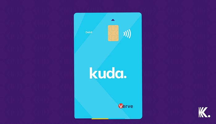
First, we flipped the traditional design on its head, literally.
Most bank cards are designed in landscape form, so when you’re using at an ATM or a POS, all the text and graphics are turned the wrong way.
We chose to design the Kuda Card vertically — the same direction you insert it into an ATM or POS. No bank name tilted sideways, no graphics looking lopsided.

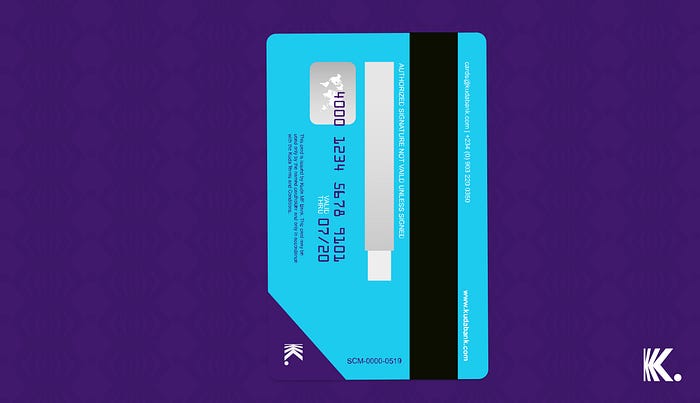
Next, we moved the card number to the back.
Let’s face it: these days, the only time you need to see your card number is when you’re paying for something online. So why is the number usually on the front of the card where just about anyone can see it? Not very safe, if you ask us.
Besides, if your CVV (short for Card Verification Value — those three numbers you use to verify your card) is already on the back, why not move the card number there too?
So we did.

Apart from being the safer and more sensible thing to do, it also means that you can post a photo of the front of your Kuda Card anywhere online without fear or the need to cover your card number.
Then, we got playful with the colour.
Black bank cards are a status symbol, silver and gold cards too. But every other kind is usually bland and forgettable.
At Kuda, everyone, not just our designers, hates bland and forgettable. For that reason alone, we decided that our card colour had to be a fashion statement.
Several colour options were considered (and fiercely debated at Kuda HQ) before we settled on a soft pastel blue.
Why pastel blue?
1. You can’t miss a pastel blue card in a crowd of cards. Bring it out at a supermarket or restaurant and wait for the cashier or waiter to stare curiously and ask you if it’s a foreign card. You’ll just laugh, say no and tell them all about Kuda.
2. Our shade of blue is close to the colour of the ocean reflecting the sky on a sunny day. Kuda was built in Lagos, and the Atlantic Ocean helps define this frenetic city of possibilities, so we paid homage to its culture and 20 million plus people with the card colour.
3. Scientifically, blue is known to have a calming effect on the mind. What better colour to look at when you’re thinking about your money, right? LOL. Blue also symbolises freedom (the sky and the ocean), trust and reliability — three things that define our mission.
So, again, what’s in a Kuda Card?
We’ll tell you:
Careful thought, emotions and deliberate design.
Like everything else we’re building for you, we put our heart into this card and we hope it makes you happy every time you use it. 💜
